Design in daily life
 We have two digital kitchen timers, both inexpensive models bought at a discount store for about the same money ($5-10).
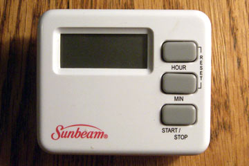
One timer is easy to set, easy to read, and easy to use. The other is none of the above. Can you guess which is which?
If you've ever wondered what good design is, or why it's important, try using the Sunbeam timer. Three buttons the same size and color give you no help in identifying what they do. You have to rely on the small text labels below or alongside. One label is unnecessarily abbreviated. Would it kill them to spell out "minute?"
To add insult to injury, the most obscure function—reset—requires that you press two identical buttons at the same time. This unintuitive action is explained with the word "reset" arranged vertically in letters even smaller than the others. Since we read left-to-right, putting letters one above the other makes them difficult to read. Good luck figuring out how to reset this timer. Combined with a small display, you get one of the most dysfunctional timers imaginable.
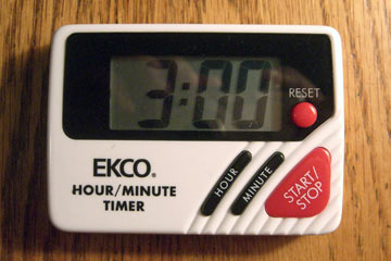 The Ekco timer does nearly everything right. Critical functions—start/stop and reset—are red buttons with unique shapes. They are easy to see and impossible to confuse. The related hour and minute buttons share shapes and color and are clearly labeled.
The large display is easy to read, even for those of us with bifocals. The design of this timer is so well done I'm almost willing to forgive the company for branding it with huge letters and an unnecessary description.
Top |
|
![]()