Inside scoop on web design(ers)
The always-interesting and authoritative website A List Apart just published the results of its 2007 survey of 33,000 web professionals.
Download a copy of the survey results for a snapshot of:
- what we look like (age, race, gender)
- where we work (geographical location, office or home, etc.)
- how much we make (salary) and the benefits we have (vacation, holidays, etc.)
- our educational background skills
- and a whole lot more
The factual data is very informative. Due to the size and scope of the survey sample, this is probably the best picture of the web profession available, especially for the U.S. (home of 48% of the respondents). Information on wages, education, hours worked and much more gives a detailed look at quantifiable aspects of the profession.
As an educator I'm very interested in the questions about education level and salaries. 58% of those with a junior/community college education make less than $40k per year while only 43% of those with a Bachelor's degree are in that range. Two more years of education makes a big (15%) difference. On the other hand, having a Master's degree doesn't translate into a significant salary jump compared to a Bachelor's degree. The salaries are very similar except at the high end, where 2% more individuals make over $100k.
And speaking of salaries, it's sobering to see that 27% of the respondents make under $20k, 17% under $10k. About 40% are in the $20k-60k range, 25% higher than that, and a few don't want to talk about it.
So, lots of good stuff here. I'm puzzled, though, by a couple of sections: Perceived Bias and Evidence of Bias.
In Section 7 (Perceived Bias) people were asked questions like "Do you think your age works against you." In this case, 43% of "under 21" and 27% of 21-24 year-old professionals said yes.
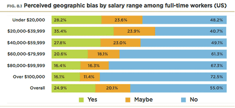
In Section 8 (Evidence of Bias) their perceptions are compared to their salaries, yielding this graph:
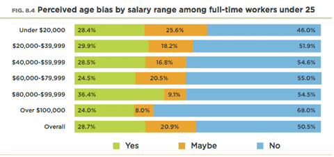
OK, what have we learned? In the accompanying explanation it says "The younger respondents (under 25) who perceive an age bias don't appear to make significantly less than their contemporaries who do not perceive such a bias."
I've looked at this graph and read the explanation over and over, and still can't connect the two. My first reaction is that the graph is the problem, but maybe it's me. I like to think that I'm pretty visually literate, so I should be able to handle this. But something isn't working.
But the bigger question is "What's the point?" There are four pages of Perceptions of Bias and eight pages of Evidence of Bias, totaling roughly 15% of the report. That's a sizable chunk. For what? To encourage us to think positively (Those who expect to make less actually do make less) ? Or to document inequality by verifying peoples' perceptions (...respondents who perceive there to be a geographical bias that has slowed their careers do indeed have significantly lower incomes than those who do not perceive such a bias)?
I'm not a statistician or a sociologist, but somehow this smacks of "junk science" to me. It seems like we've verified something, but I doubt it.
A disclaimer: I saw the survey results for the first time this afternoon and wanted to get the article online tonight, so I haven't spent hours and hours pouring over the date. These are first impressions.
Top |
|
![]()