Menu changes
"For your convenience we have changed our menu selections..."
Yeah, right.
You've heard those annoying words before, and you know that the changes made have been for the convenience of the company, not you. But in this case I've made menu changes that really are for your convenience, and I hope you agree.
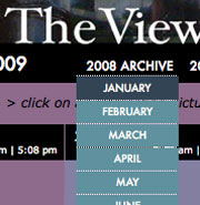 It started a couple of days ago when I ran out of space on the homepage to list links to each month for the years 2007 and 2008. The list stretched too far across the top. I promptly replaced these links with what's called a "drop-down menu"—when you put your mouse over the "2008" a vertical list appeared below it, as in the photo at right. You'd then move your mouse down to the month you wanted and click again to go to a page for that month. Pretty slick, no?
Here's a dirty little web design secret: we (designers) love little gizmos like this because they add motion and activity to an otherwise static website, but surveys show most users—that's you—hate them. Users typically prefer simple text links to click on. Designers who care constantly try to balance interesting effects with good usability, and sad to say usability frequently loses.
In my case another problem cropped up. The drop-down effect didn't work properly in Internet Explorer, the browser about 25% of you use. My quick fix was to make the words "2008 ARCHIVE" a link that goes to a webpage with all the months listed. I spent most of the afternoon today working on those pages for 2007 and 2008, and finally realized that it's much easier to read and browse the whole year at once rather than picking a single month from a menu.
So, after only four days the drop-down menus are gone, and there are brand-spankin' new pages for the 2007 and 2008 archives. Take a look and tell me what you think.
Top |
|
![]()