Signs of Spring
Forget the robins. Forget the crocuses.
Today at Edgewater Park I saw far more substantial signs that Spring is here:
Their work is finished.
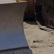
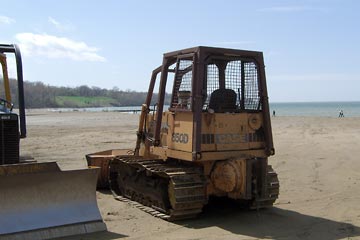
1) Bulldozers
parked on the beach after being used to scrape the big piles of driftwood,
plastic containers, and zebra mussel shells off the sand.
2) The metal shutter of the refreshment stand rolled up again. Now we can buy hot dogs, Pepsi, and of course, worms and maggots (live bait).
3) The restrooms, unlocked for the season. No more green plastic Porta-Potti. Summer can't be far away.
TOP
Ya gotta like that
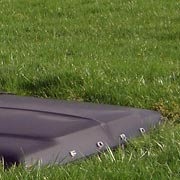
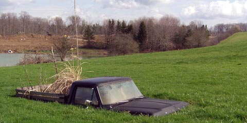
I've heard of truck farming, but really...
I don't know what it means or why it's there, but a Ford pickup emerging from a grassy hillside just makes me smile.
We were visiting Daybreak Lavender Farm, a pretty neat place in its own right, when I spotted this across the road. Judging from the "life-size" dragon and Don Quixote made of scrap metal I'm gonna guess that a sculptor lives here.
I guess when his old Ford pickup died he wanted to really put it out to pasture.
TOP
Google map mashup
I've talked about Google maps before, and yesterday spent a couple of hours adding more locations and pictures to the map of the Cotswold Way showing the route Joanne and I walked in 2004.
This type of user-customization of information provided by another source is sometimes called a mash-up. Want to try your own Google Map mash-up? This three -minute CNET.com video shows you how.
TOP
Design can change
I'm happy to see many positive signs in design industry/community of people learning about, and taking action on, sustainability, global warming, etc. Just today I ran across a new website, DesignCanChange.org.
When I went to the site I was dismayed to see that it falls into the "design-y" trap of using Flash to create what could be done quite nicely in HTML/CSS, without some of the spiffy animation. This annoys me because even with a DSL internet connection I had to wait as first the splash screen loaded (why bother with it?), then had to watch another spinning "loading" icon before the main screen came into view. If this is irritating with a DSL connection, pity the 10-20% of Americans still using dial-up connections.
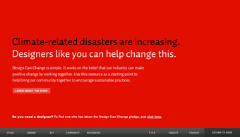 Why
not make the information the priority rather than the animation? This main
screen that you eventually get to would work every bit as well, albeit without
the transitions as the main text appears.
Why
not make the information the priority rather than the animation? This main
screen that you eventually get to would work every bit as well, albeit without
the transitions as the main text appears.
The animated menu bar at the bottom could be done with static images, or you could use a CSS rollover effect similar to that used with the two photos at the top of this page.
If you really, really, really want the admittedly kind of cool animation that Flash provides, why not confine it to the bottom navigation strip? The main text would load quickly as HTML, and while you were reading it, the Flash would be loading in the background. Presto! The best of both worlds.
OK, end of rant. I just hate to see designers get so caught up in visual effects that they forget that the important thing is to tell their story to the audience, in this case an incredibly important story.
Still, especially if you're a designer yourself, you should check out ![]()
TOP
ARCHIVE
- Student portfolio review
- Dad's birthday
- Red {an orchestra}
- Web 2.0 successes
- Car tattoos
- Great brunch
- TED Talks
- Poor infographic
- Silverlight vs. Flash
- Recycle + exercise
- Better designer tips
- Our Town, CPT
- Audio news
- Old Ford
- Sound of ideas
- Nashville trip
- Dream house
- Soccer in the suburbs
- Hospital story
- Fragments
- Mixed message
- Multiculturalism at Tri-C
- Pretzels
- SEO Pyramid
- Spam, monkeys, Shakespeare
- Sebastien Chevrel
- Spring blossoms
- Towpath Trail
- Designers Toolbox