Presidential PowerPoint
 In honor of the Presidents' Day holiday, let me share with you an antidote to all those boring PowerPoint presentations you've had to suffer through.
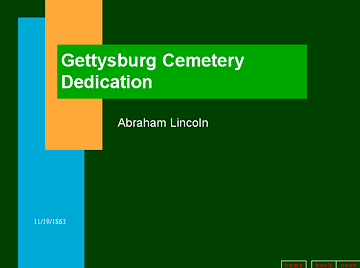
Take a look at the presentation Lincoln could have made at Gettysburg if PowerPoint had been invented... see it now.
This would be funnier if it weren't so true.
The spoof presentation, created by Peter Norvig, Director of Research for Google, has become so popular that it's the No. 1 result when you Google "powerpoint presentation."
But why does this strike a chord? We—especially teachers—have been told that people learn better when they see information as well as hear it. We've all drunk the kool-aid on that one, leading to endless variations of snappy bullet-pointed outlines and cheesy animations projected on countless screens in classrooms, meetings and conferences.
Yet one of the most memorable presentations I've been part of was by Richard Saul Wurman, an architect/designer who invented the term "information architect." He walked on stage as a featured speaker at an AIGA conference many years ago, and announced that he wasn't going to use any slides. In fact he insisted that the conference logo being projected on the screen behind him be turned off.
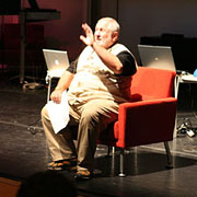 When the screen went blank, he pulled a chair to the front edge of the stage and proceeded to sit and talk to and with the audience for about an hour. Although he did most of the talking, it was still more like a conversation than a speech. With nothing else to look at, we focused on him and what he was saying.
So, am I saying that visual aids—PowerPoint, even—are a bad idea? Not exactly. I'm saying we need to think about what we're showing, what it will add to the message in the context of how it's presented, and use it or not based on the value it can provide. Pictures for the sake of having pictures are not a good idea. Visuals that distract from the meaning of the message are counter-productive. Bad graphics are not necessarily better than no graphics.
And PowerPoint is not necessarily better than making your point with words, with gestures, with staying in contact with your audience.
Top |
|
![]()