Making information visible
Process
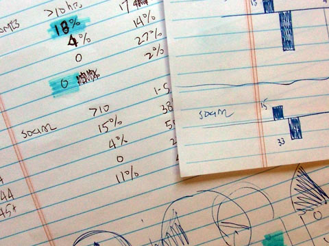 Faced with interesting yet complicated numbers from my What's Your Media Diet survey, I knew I'd have to make the information more visual.
It would help others make sense of the data, and more importantly it would help me make sense of it.
I tried simple bar charts, but from the start I thought about a human face (sketch at bottom right) since the numbers represent peoples' opinions.
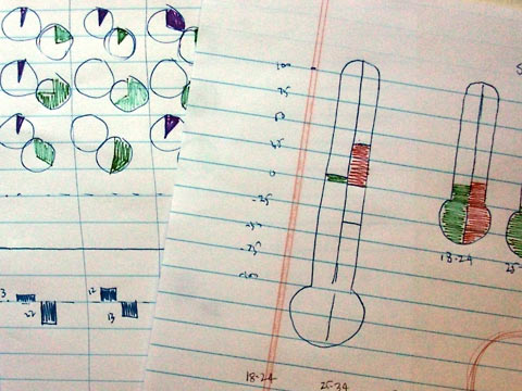 A bar chart was easy to do, but it didn't have the clarity I was looking for. Maybe a pie chart would be better.
I looked at survey responses in terms of what people really like and really disliked, which led to pairs of charts.
From the paired pie charts I tried thermometers, split into positive (green) and negative (red).
I kind of liked the thermometer idea, but the image itself was irrelevant to my data. Rather than helping clarify the numbers it might add to the confusion. Not a good idea.
 I went back to faces, trying first the Greek tragedy/comedy mask (top right), then emoticons, and finally smiley/frowney faces similar to those used in the Wong-Baker Pain Rating Scale.
A sidelight: there's something about those faces... an article I wrote a couple of years ago about the Wong-Baker chart has consistently been the most popular page on my website.
People are constantly searching for pain chart faces, smiley face pain scale, pain chart with faces, smiley face pain chart, etc. Year after year it attracts nearly five times the visitors of whatever is in second place!
Result
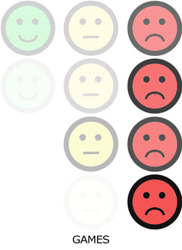 Maybe I was subconsciously playing off the Wong-Baker chart. Here's what I came up with:
Top to bottom the rows represent age groups: 18-24, 25-34, 35-44, 45+.
Left to right, you see positive (green smile), neutral (yellow straight) and negative (red frown).
The opacity of the color indicates the degree, so the first row shows that of 18-24 year olds, 33% like video games, 20% sort of like them, and 37% dislike them.
Following along in the same way, the bottom row shows that among the 45+ age group, 0% like games, 2% sort of like them, and 93% dislike them.
I think that this dramatizes the differences between age groups in a way that helps us understand them better.
The fading of "like" and "neutral" combined with the darkening of "dislike" makes the differences between generations quite clear, I think.
What are you?
Add your smile or frown to the chart by taking the survey, especially if you are a design educator or design student: What's Your Media Diet?
More on this research project: Number-crunching.
Inspiration: InformationIsBeautiful.net
Top |
|
![]()