Turn me on, if you can
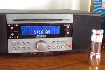 It's cheaper than a Bose Wave, looks better, and sounds great. Unfortunately the Cambridge SoundWorks tabletop radio/CD has a terrible user interface.
There's a reason why a small flashlight has a permanent place on the shelf nearby: the radio's control buttons are so small and labeled so poorly that even in daytime we need extra light to figure them out.
Other than the big volume control knob, the buttons are maddeningly identical in size, evenly spaced and marked with tiny white-on-silver type and even smaller embossed icons.
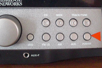 See the bright red arrow? That's a piece of tape I stuck on to make at least the power button stand out from the others.
OK, I get it. I'm supposed to use the remote control to do everything. The buttons on the remote are easier to see and identify, thankfully. But I actually have to walk past the radio to get to the remote, usually on the coffee table in front of the couch.
Why make me find the small (i.e., easy to lose) remote, pick it up, turn and point it at the radio just to change the station? It would make a good product much better if these buttons were designed, arranged, and/or labeled to make simple tasks easy to do.
Hello Cambridge SoundWorks...anyone listening?
World's worst fare machine—October 11, 2009
Confusing phone interface—January 26, 2007
Top |
|
![]()