Simple is good
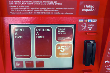 The Red Box DVD rental machine outside Dave's Supermarket caught my eye yesterday. I've never actually used one to rent a video, but the design makes it look super-easy.
From the big on-screen"buttons" with two main choices to the credit card reader that stands out because of its shape, color and location, this is a great example of user-friendly design.
There may be many more things you can do after the first step, but it won't take you long to decide where to "push" to get started. Your choices are simply and clearly presented. The card reader has a shape that allows a particular motion, a "swipe", also shown with a simple drawing and label above. In design the term affordance describes this connection between an object's shape and how you interact with it. For more, see Don Norman and Usable Design.
 The Bad and The Ugly
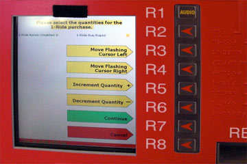
Compare the machine above with another red box, an RTA fare machine. I defy anyone to look at this screen and at a glance have the slightest idea of what they are choosing.
Worse yet, this screen is only one part of an unbelievably badly designed user interface. You can see and read more about how not to design a fare machine at The World's Worst Fare Machine.
Silly but effective
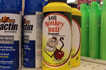 On a lighter note, while I was still in the grocery store I noticed this product on a shelf as I walked by. I've never seen it before, but between the name and the illustration, the label gave me a pretty good idea of what I'd use it for.
Maybe it's a bit crude and silly, but it makes its point clearly.
Simple is good.
Top |
|
![]()