World's worst fare machine
 I was going to make it a question, but instead I'm granting the title outright to the Greater Cleveland Regional Transit Authority.
Any city that wants to challenge it will have to prove to me that their fare machine is more poorly designed, incomprehensible, and user-hostile than the RTA one you see here.
I've used fare machines in U.S. cities like New York, Chicago, Washington D.C., San Francisco, Boston, and Portland. I've used them in London, Paris, Amsterdam, Helsinki, Athens, and Barcelona.
Without question Cleveland's is the worst. I used one for the first time yesterday and was completely baffled.
A helpful bystander pushed buttons for me so I didn't hold up the line. Otherwise I might still crouched there in front of the tiny screen that grudgingly reveals the choices you have to make by pushing the most confusing array of buttons imaginable.
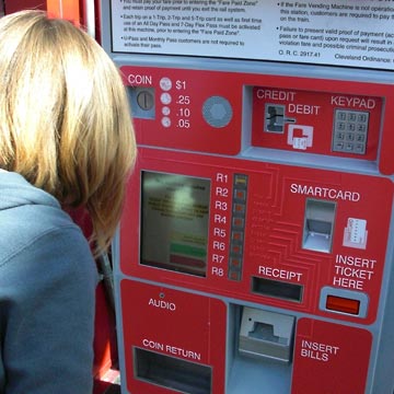
Step One?
 Take a look: where do you start?
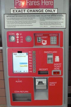
Seeing the prominent "Exact Change Only" warning I dug two dollar bills and a quarter out of my pocket, ready to go. I looked in vain for "Start Here," "Buy Farecard," or "Step One."
Nope. The red and white panel has lots of words, slots and numbers scattered haphazardly around, but none seem to indicate where to begin the process.
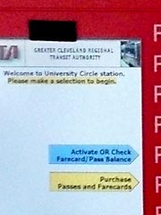 Oh, wait. There it is on the little screen, see it? On the top, just under "Welcome to University Circle station"—it says "Please make a selection to begin."
Why they've even highlighted in in yellow so you can't miss it!
Step 2
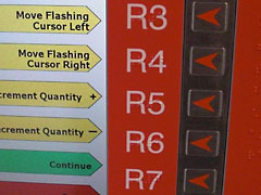
That was bad enough. The next screen is worse. The quantity is shown in the yellow box in the top right corner of the machine's screen. Yes, that's it, the little yellow box. See it?
Try using the zoomable image at right. Click in it to move around, click the "+" sign to enlarge. Eventually you'll see the numeral "0" in the box.
Since I actually wanted to buy a Farecard—what a surprise—I needed to change the quantity from "0" to "1" by picking the one of four identical yellow arrows that said "Increment Quantity +"
"Increment Quantity?" "Decrement Quantity?" You've got to be kidding me. Who talks like that? Who are they making these for?
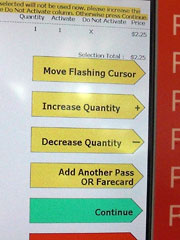 On the next screen someone decided that "Increase Quantity" and "Decrease Quantity" would work just fine. But having improved that a bit, they decided to take away the option to "Move Flashing Cursor Left" or "Move Flashing Cursor Right". You can only "Move Flashing Cursor". I guess it goes whichever direction it feels like.
But why all this fussing around anyway? Wouldn't it make sense to automatically start with a quantity of one, since that's what most people would want?
How about a big green arrow that says "Buy one Farecard"?
The end
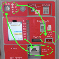 Eventually you get to a point where you need to put your money in. Bills at the bottom right, coins at the top left—as far apart as they could put them.
Success! Magically your farecard pops out of a slot labeled "Insert Ticket Here."
What a nightmare. It's as if no one had ever designed an ATM, let alone a fare machine before. Could the manufacturer of this machine be any more ignorant of the basic principles of visual and industrial design?
We haven't even talked about the screen and the buttons next to it. First of all, using a touch-screen instead of physical button, hardly a revolutionary concept, would make things much easier.
 But since that radical approach must not have occurred to the designers, could they have made the button arrangement any more confusing?
The yellow, green and red arrows on the screen point to the numbers R1 through R8, which have no connection to anything I could see. To the right are red arrows pointing to the numbers—which mean nothing—but are next to the arrows on the screen, which mean something. If you can figure it out.
In conclusion
This machine is designed so badly as to be virtually unusable. There's no information hierarchy, color is used poorly, the physical layout is awkward and confusing.
I have a college education, design computer interfaces, am used to riding public transportation, English is my first language, and the damn thing is incomprehensible. Imagine what it must be like for someone who doesn't know what "Decrement" means, is unfamiliar with the term "cursor," is taking public transportation for the first time, or is a visitor who doesn't speak much English.
Welcome to the RTA. Good luck getting around Cleveland.
More
Worst Fare Machine, Revisited (April 9. 2010)
In response to many complaints, RTA added a panel of instructions to the machines. That would be laughable if it weren't so irresponsible.
Top |
|
![]()