 Not much help
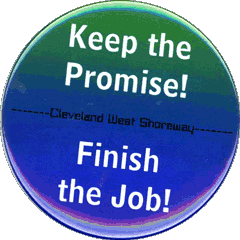
Look at the button people were wearing at a packed committee hearing in Columbus. What they are fighting for (or against)?
The design of the button makes it nearly impossible to tell.
The slogan in white letters could apply to anything. Who promised what? What's the job?
The promise and job have to do with the Cleveland West Shoreway, in nearly invisible small black letters against a dark blue background.
My wife rode a bus to Columbus today wearing one of these buttons. She sat in a packed hearing room to urge the Ohio Department of Transportation to fund a project to improve the West Shoreway. A lot of people made a strong effort to be heard, and their buttons didn't help much at all.
Make it better
It's not hard: any of my first year Visual Communication students could point out the problems and suggest solutions. For me, though, it brings back memories from 30+ years ago when I was a young graphic designer working for the social justice arm of a local church group. We often organized campaigns that took busloads of people to Columbus to sit in packed committee hearing rooms.
Mark Real, my politically-astute boss, knew that our message wouldn't be misunderstood if everyone wore a mini-poster with a punchy campaign slogan on it. That's what a button should be.
 We took it seriously. For each issue, we came up with a short, clear statement of our goal. I designed a graphic and we printed badges on self-adhesive fabric—cheaper, better-looking, and more versatile than metal buttons.
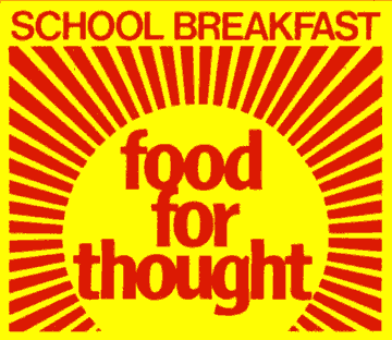
One of my all-time favorites was this bright sunrise that made our argument that free school breakfasts for poor kids was first and foremost an investment in education.
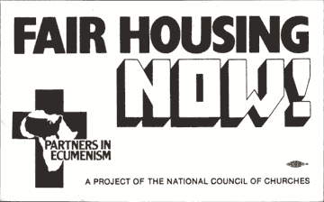 The Fair Housing sticker wasn't a thing of beauty, but there was no mistaking what the demand was, and who was behind the effort.
Don't fake it
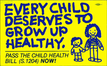 For the Child Health campaign we had to tug at the heartstrings of legislators. In 1979 they were no more inclined to spend money on health care for the poor than they are today, so we decided on a child-like appeal.
Designers often make the mistake of trying to fake this sort of thing, but you can always tell it's an adult pretending to draw or write like a child.
I knew better. I commissioned my eight-year-old daughter Sharon to illustrate the sticker. I adjusted the arrangement and spacing of the words to fit our layout, but they and the litte people are authentic kid's stuff. I might have paid her with ice cream.
If there's a lesson to be learned here, I guess it's that the little things count. Sweat the details.