It's about time
You've seen the standard U.S. food nutrition labels on packages, a simple black & white list in Helvetica type. Just the facts, ma'am.
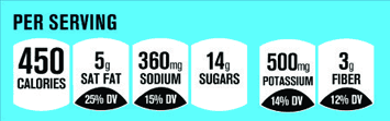 Well, the grocers' trade association has another idea. They are suggesting a more graphic label like the one shown here.
Better? Maybe not.
Notice that the black areas that show the percent of the recommended daily value of each item are the same size regardless of the number. They all appear to show the same (relatively small) Daily Value despite the fact that the "Fat" DV is twice as much as "Fiber."
This type of graphic makes it difficult to compare at a glance amounts or Daily Values because the visual display is identical. You might even wonder if that's the intent.
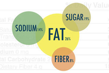 Fortunately, GOOD magazine and the University of California, Berkeley have created a competition to design better food labels. Their challenge is to "make the redesigned label informative, instructive, and memorable."
This sample uses size and color to show the different Daily Value percentages. Actually it's is inaccurate: "sugar" at 19% should be larger than "sodium." But the idea is an improvement over the original.
The competition deadline is July 1, 2011. More information: Rethink the Food Label.