Fancier, yes.
Better? You be the judge
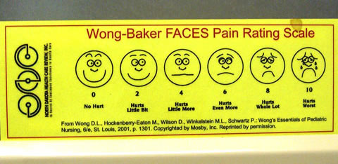 The standard Wong-Baker Pain Rating Scale in my doctor's office looks like this: simple smiley/frowny faces, in smiley face yellow.
Not everyone is happy with this simple chart. They've tried to improve it by adding color, 3-D effects, and other graphic trimmings.
Look at the "improved" pain scales below, and let me know if you think they are easier to read or more understandable than the original by taking the simple poll that follows.
DIMENSIONAL
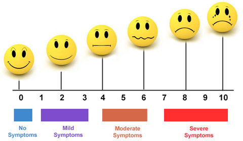
In this version the yellow faces have shading and shadows to give them a 3D look.
Rather than being at the same height, they are placed higher and higher based on their 0-10 rating.
Color bars below the scale combine with words to explain the faces.
Notice that instead of labels like "Hurts a little bit" and "Hurts more", the words have been changed to "Mild Symptoms," "Moderate Symptoms," etc.
COLORFUL
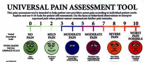
This version adds more words to describe the pain and the facial expressions.
It also colors the faces and the number bar above to indicate pain levels. Note that the colors, except for red, differ from those used in the chart above.
YOUR TURN
Better or worse?
You've seen two variations on the original that add more visual design elements. Do they make the chart easier to use or understand? Keep in mind that the primary purpose of the chart is to give the patient a way to describe his/her pain to the doctor.
Vote for your favorite in this highly unscientific poll:

A little history
I originally wrote about the Wong-Baker pain chart after a visit to my doctor in February 2008. Since then—to my complete surprise—the article has been by far the most popular of more than 1,000 pages on this site. In fact it's gotten nearly three times the pageviews of the second-place page (which includes an Etch-A-Sketch portrait of LeBron James). As of September 2014, this page that you're currently reading is in second place, about to pass the original.
You may also enjoy:
Designed to confuse? Strange icons on microwaves & other appliances
Press the shiney black button, dammit! You'll never get the door open otherwise
Lost in translation Pig & penguin on a Finnish bus
Which One Is It? Confusing & amusing restroom signs around the world