Test results
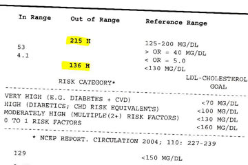 I recently got the results of my annual blood test. The part that deals with cholesterol looks like this. I had to highlight the numbers in yellow to help me make sense of the "explanation" at right and below.
For a health issue that quite literally could involve life and death—especially for guy my age—this piece of paper didn't give me a whole lot to go on.
An article the other day posted on the excellent Information Is Beautiful site shows their re-design of a similar test results form.
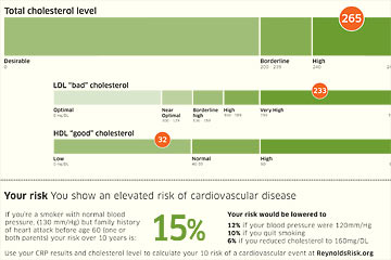 Lo and behold, using basic design principles and adding color shows the numbers and their meaning much more clearly.
The explanation of risk puts the numbers in a larger context. Ideally you'd get this information from your doctor, but still it's helpful to have it here.
This design won a recent WIRED Magazine competition called The Blood Test Gets a Makeover. Follow the link above to learn more and see other winning entries.