Old-school tools
 As I've been sorting through my office to get it into post-retirement mode, I found these. No young graphic designer will recognize them, but if you were around in the days of "keyline and paste-up" you will.
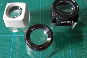
They are "loupes", magnifiers used to see details of type and halftone screens. The rectangular one at top right specifically designed to look at slides (remember them?).
The computer desktop publishing revolution made these and many other tools irrelevant. If you like this kind of stuff you'll love The Museum of Forgotten Art Supplies.
 And if the loupes seemed strange, how about these?
Give up?
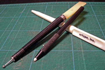
They are tools used to rub down pressure-sensitive transfer lettering like Letraset and Artype. It's what we did before the Mac and laser printers made everyone a typesetter.
The black metal tool with a nylon tip was the "professional" model from Letraset. I used it to rub down small sizes of type (24 pt or less).
The ball-tipped one with a white flat burnisher on the other end was made by Chartpak. It's high-tech: spring-loaded so that you can adjust the pressure on the tip. This was my "go-to" tool: rub down with one end, burnish flat with the other.
The white plastic Artype one is the most basic. Didn't use it much.
These I used a lot: dividers. Mouse over the image to see how.
The artwork for a poster, flyer, or anything else was made up of individual pieces of type and art positioned on a board and glued in place. To get equal spacing between lines of type that had been cut apart, you'd set the dividers and then compare each line.
It was a slow and exacting process but you developed an exquisite visual sense of spacing that is hard to get when working on a computer.
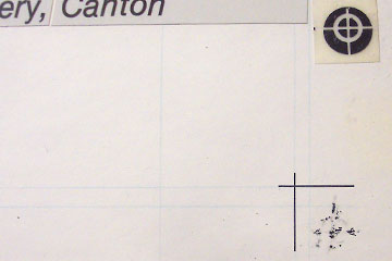 Here's the lower right corner of a paste-up board for a poster. You can see the faint blue "keylines" that show the edge of the page. The black crop marks indicate the actual corner.
The second set of blue lines beyond them indicate the "bleed" area. More blue lines show points of alignment for other elements.
I seem to have goofed on this piece. Normally the crop marks don't go all the way in to the corner but stop at the bleed line.
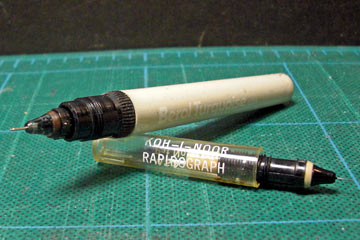 Crop marks and any other lines or rules were drawn by hand. Most of the time I used the workhorse Koh-I-Noor Rapidograph pen, although here the body at least is a Berol Turquoise.
These technical pens, as they are called, came in a variety of thicknesses. I probably used a #1 for crop marks.
The thin, hollow points had a even thinner wire and weight inside that you'd shake to clean the tip itself. They would still clog at the worst possible time, so it was always good to have a spare tip or two on hand.
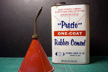 In my early days I used rubber cement to glue things in place, but soon switched to the neater and far less toxic wax adhesive.
If you used rubber cement you had to choose: one-coat or two-coat? This debate reached near-religious intensity. I was a one-coat fan.
The red container held rubber cement thinner. The twist tip let you easily seal it so the highly volatile (and toxic) liquid didn't drip or evaporate. Long after I switched to wax, I kept this guy handy for removing labels, tape residue, etc.