Bulletin board critique #2
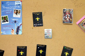 Not long ago this bulletin board was covered with posters and flyers, making it hard for any one to stand out. Not any more.
Look at this picture: where are your eyes drawn? I'm guessing the blue poster at top left. It has two powerful design principles going for it:
1. Location: since we read from top to bottom, left to right, top left is where we automatically look.
2. Size: bigger usually means more important. Since this is the largest object on the board, it tends to seem more important than the smaller ones.
But...
The small black and yellow cards actually caught my eye before anything else. What do they have going for them?
1. Color: the yellow (brighter in reality than in this picture) on the jet-black background really stands out among the other more neutral colors.
2. Repetition: we give more importance to repeated shapes. In a movie review, four stars is better than one. Quantity and quality aren't the same, but we still are influenced by quantity.
What caught your eye, and why?