Ouch!
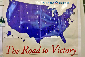 There's an Obama-Biden poster on our refrigerator that makes me cringe every time I look at it. It's especially painful coming from a political organization that's been widely praised for great graphic design.
Heck, there's even a book and iPad app called Designing Obama.
So what happened? Sometime between 2008 and 2012 the design wheels started to fall off. Sharper minds than mine are debating the new typefaces the Obama campaign is using this time around.
My complaint is even more basic: whoever put this poster together must have dozed off during Typography 101. One of the main concerns when working with type (letters, numbers and symbols) is spacing. It should not be done mechanically (a fixed amount of space between letters) because they have different shapes and fit together differently.
Students in that Typography 101 class learned about kerning, the critical skill of adjusting space between characters in a word so that the spacing looks visually consistent.
But the spacing is painfully not consistent in the word Victory. Any designer worth his/her salt would have fixed this by kerning the V and i more closely.
They would have also adjusted the word spacing between to and Victory to reduce the too-large gap.
To see these adjustments as I might have made them, mouse over the image above.