Stealth ad
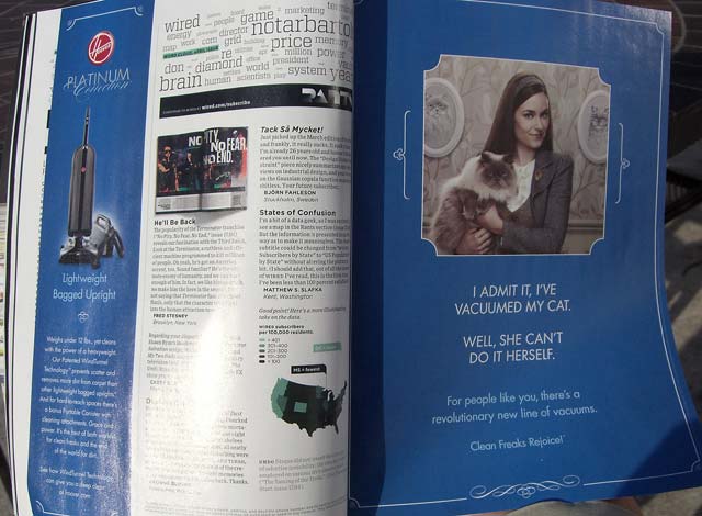
The full-page ad on right only makes sense when you see the left column on the other page.The full-page ad at right is from a recent issue of WIRED magazine. Look at it for a minute and see if you notice anything unusual.
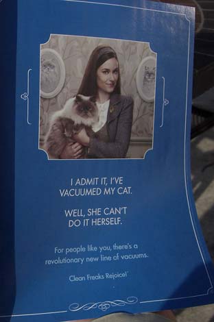
Where's the company name? The logo? It's obviously an ad for something, and you probably figured out that it's a vacuum cleaner. But which one?
Move your mouse over the image to see the opposite page.
In a pretty daring move, Hoover is counting on you noticing a one-column ad on the left that fills in the missing information. They have, of course, used tried and true visual communication techniques to make this happen.
One of the most powerful design concepts based on the Gestalt principles of visual organization is similarity. Our brains are hard-wired to look for things that are similar and we automatically link them in our minds.
In this case the most obvious similarity is the blue background with white type. Also, the typeface is the same in both ads, the photos are muted shades, primarily gray, and don't forget the white border with inset rounded corners. There's even the subtle connection between the fancy decorative swirl at the bottom right that echoes the curving script of the word "Connection" at the top left.
The cherry on the top is, of course, a round red Hoover logo at top left. This uses another principle, contrast, to draw your eye. The shape and color create a different element in a sea of similarity, guaranteeing that you'll notice it.
I don't know how effective this ad was, but I'd love to. Its designers did a good job of using techniques we know should work, but you can never predict for sure how readers will react. There are other things in the magazine that may distract them. As they scan the pages left to right, following our normal reading pattern, they have to stop and go back to see the left-hand ad. That may not happen with most people.
This is the sort of thing that makes studying visual communication interesting. It's the kind of thing we do in my Intro to Visual Communication class at Tri-C. I consider the class a success when a student says "You know, I drive all my friends crazy now, pointing out how and why magazine and billboard ads look the way they do." Ah, music to my ears.
More about Visual Communication
Coffee, Clavey, and Visual Literacy—February 29, 2008
Watch out! Diagonal lines mean trouble—January 8,2008
Visual communication, it's everywhere!—December 5, 2007
It's Visual Communication, not Drawing—September 5, 2007
Top |
|
![]()