Why argue with success?
Apparently Les Otten, candidate for governor in Maine, has decided it's easier to imitate Barack Obama's logo and website than to come up with an original way of presenting himself to the public. Move your mouse over the Otten homepage below to see the Obama website from February 2009 (courtesy of the Internet Wayback Machine). Similarities are listed below.
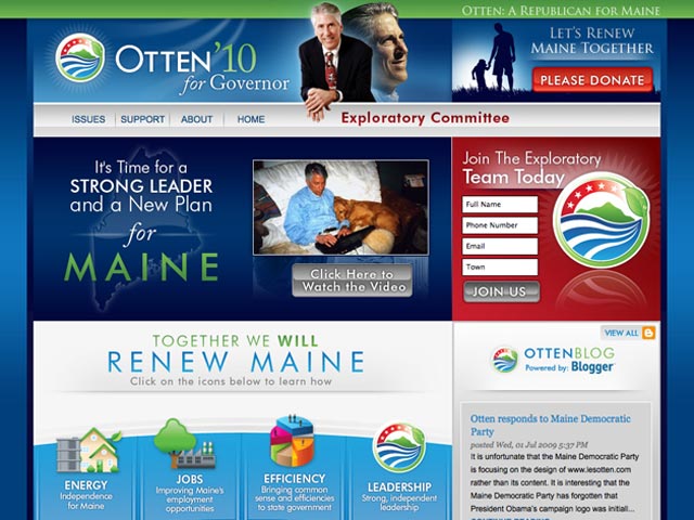
Let's see, what similarities can we find?
- Logo (with the addition of green elements)
- Overall color scheme (with addition of green elements)
- Extensive use of gradients (color shading dark to light)
- Underlying grid (where the major elements line up on the page)
- Typefaces (headlines are the same two typefaces). Technically speaking the combination is a modern-looking sans-serif, and a traditional serif font.
- Type design (note the combination of sans-serif with italics in the "Great Need" and "Strong Leader" headlines)
- Faded back "swirly" elements behind photos at top and behind headlines of main article.
- Photo style and orientation (Les Otten's skin tone even matches Obama's)
So what?
Other than taking the lazy way out, is there anything wrong with what the Otten campaign has done? After all, isn't imitation the sincerest form of flattery? There are at least two issues: artistic and political.
On the political front, even the Maine Republican Project has concerns. On July 1, 2009 they posted their own article comparing the sites. The Otten campaign responded to this and other critical articles, saying in part:
We are very proud of our website, which was built from scratch, from the ground up, by a locally owned company – INsyt of Farmington, Maine...
The Les Otten Exploratory Campaign did not copy from anyone’s website. We built the website up from the letter “O” because Les’ last name begins with the letter “O.” We used industry standard templates placing images on the website where people’s eyes naturally follow. The color schemes of blue, red and green are prevalent throughout political websites across the United States...
Why would a Republican candidate want to adopt the widely-recognized look of the Democratic president? This plus his obvious emphasis on "green" may mean he's trying to establish himself as a "new" Republican. I don't know what Maine voters are like, but I'm pretty sure this won't go over well with Rush Limbaugh and friends.
Inspiration vs. appropriation
As we've discussed in the case of Shepard Fairey (Obama poster designer) and the photograph it was based on, artists routinely are inspired by what they see. The problem comes with what they do next. There's a very blurry line between inspiration and plagiarism, and the Otten website is smack dab on that line. The Daily Kos puts it a bit farther over: "the most blatant attempt at jacking someone's branding that I've ever seen..."
In my view it's just plain stupid on several levels. If one of my Web Design students handed in a project like this I'd give them some credit for doing a competent job of duplicating an existing design. On the other hand we'd have a serious talk about the ethics and appropriateness of what they did.
What do you think? Click "Comment" below to add your opinion.
More about design
Packaging pornography: sexy water bottle—August 9, 2008
Can Design touch someone's heart?—March 15, 2008
Thinking about design—February 24, 2008
More about politics
Campaign graphics smackdown—January 23, 2009
Design infomercials—December 4, 2008
Door to door for Obama—Nov. 5, 2008
Top |
|
![]()