Bulletin board critique #1
I love looking at bulletin boards, partly to see what's going on at a school or wherever I am, and partly to see how people try to communicate what they have to say or sell.
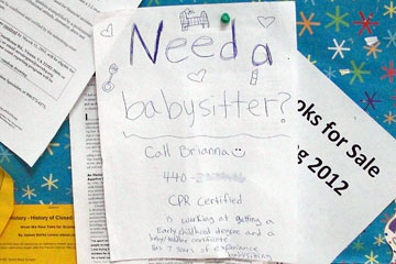 Brianna is probably a good babysitter, if you NEED one. Might have been better to emphasize "babysitter".
And it's too bad that Brianna seems to be running out of energy as well as space as she moves down the page.
Her study towards a degree in Early Childhood and seven years of experience could be pretty persuasive...if you happen to notice them.
HIERARCHY
One of the most important rules in visual communication is to create a clear hierarchy: the most important information should be emphasized via size, color, placement, or a combination of these. Brianna didn't do that very well.
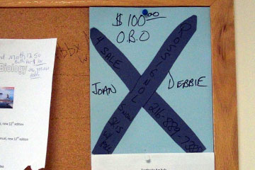 This flyer has great hierarchy...sort of. One thing really stands out. But despite what your first impression might be, this isn't an invitation to an X-rated encounter between Joan and Debbie (sorry, guys).
Look closely and you'll see that instead, Joan Debbie (?) is selling a pair of Rossignol snow skis w/poles.
Good try, but this one misses the mark for emphasizing the wrong thing. And for using black letters on a dark blue background.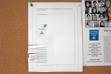
Here's a for sale flyer that's classier than most. Clearly thought and care went into this. It's pretty darn elegant, but...
We have a hierarchy problem again: the image of the book is so small it's hard to see at a glance, and the description at the top is smaller still. A flyer shouldn't whisper, and this one does.
Putting the tear-off phone number strips on the side gets points for being different, but that's about it. Different doesn't always mean better. In this case it makes the flyer less recognizable as advertising something for sale. Tearing them off seems more awkward, probably just because they're not what we're used to.
I'm guessing that this was created by a student with some background in design. It's attractive in a way, but ineffective in commuicating its message. I'd give it a C-, but would love to talk with the student about how to make it better. I'll bet version 2 would much better.