Busy week, no time to write. Here's something interesting I found on the web:
Responsive grid
 With more and more of us using our phones and tablets to go to the Web, one of the hottest techniques in web design is what's called "responsive" web design.
Simply put: you create a flexible structure for your information that adapts to different screen sizes, from a 24-inch desktop monitor to a 320 pixel wide smartphone.
Easier said than done.
One of the most powerful tools in any designer's command is a grid, used to keep visual elements organized on a page/screen. On paper, grids are easy: everything stays where you put it. On the web, not so much.
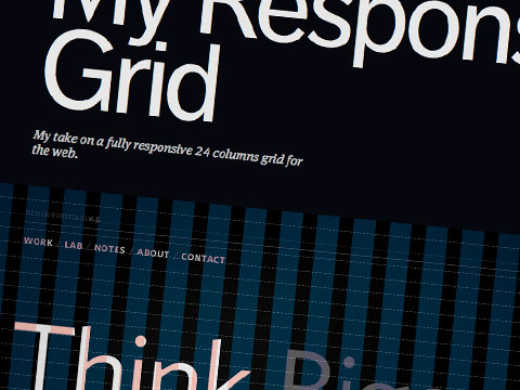
Here's a sophisticated 24-column web grid created by Lucian Slatineanu that claims to be responsive. I haven't tested it extensively, but it looks promising.