What were they thinking?
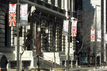 Driving through downtown Cleveland I noticed banners on poles outside of the Main Library trumpeting the rating they'd received from The Library Journal.
I'm happy that our hometown system is highly rated. They got the top score: five stars.
I'm glad they're advertising their success. But I think they need to talk with their designer about the banners.
Hierarchy
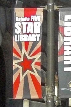 A fundamental principle of design is hierarchy. The designer's job is to make the most important information look most important.
You can show hierarchy in a number of ways: size, color, position, etc. As a general rule, the most important things are placed higher and/or made larger. Take a look at this photo of the actual banner.
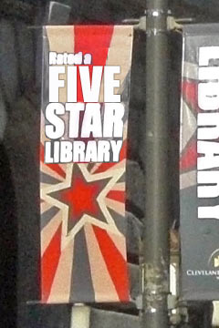
Colorful and lively, it tells us pretty clearly that this is a STAR library. Scroll down for what it could—and in my opinion should—have been.
 That's what I'm talking about!
Lots of libraries are two, three or four star libraries. We're a five star library. That's what's important. That's hierarchy.
Could be worse
As unfortunate as this situation is, not much harm was done. The library just didn't announce their success as clearly as they could have.
Hierarchy—or lack of it—comes into play in all types of design, as another local agency, the Regional Transit Authority, demonstrates with The World's Worst Fare Machine.