User interface
 Creating a website with a simple, clear, usable interface is a challenge.
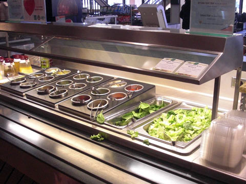
We could do a lot worse than modeling it on a salad bar. This one, in the cafeteria at Tri-C West, is a model of directness.
At the far right there are stacks of containers. Take one and step to the left. Pick up the tongs and put in a lettuce. A lot of lettuce. The big bin makes it clear that this is the main ingredient.
Next, a smaller bin suggests adding some spinach before you move to the array of items in much smaller round containers. They are semi-arranged by type, but no priority is given to any particular item.
When you arrive at the far left you see large pitchers of salad dressing. Pour some on top, and move around the corner to find sunflower seeds, raisins and croutons in small bowls. Sprinkle a little on top.
Following the rules
Compare the salad bar to these characteristics of a good user interface:
- Clear
- Consistent
- Simple
- User-Controlled
- Direct
- Forgiving
- Provides feedback
- Aesthetic
I'd say our salad bar rates OK to Excellent on all of them. Try comparing your favorite website to the salad bar, see what you think.