New logo (or not)
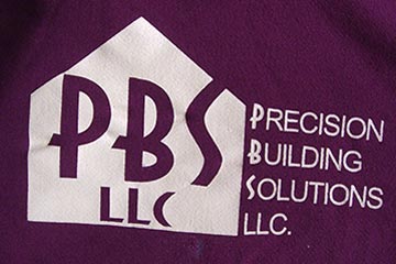 As I mentioned a couple of days ago, I'm finding myself back in the world of print after spending most of my (design) life working on screen-based projects. Yesterday it was trying to upgrade my son's company logo, seen here on a sweatshirt.
I basically hate his existing logo. It looks generic and amateurish. Aside from the obvious reference to a house, it doesn't say "Precision" "Building" or "Solutions" effectively. In my opinion.
So I tried to develop a new visual, one that conveys both strength and precision. Not to mention a typeface that was less ornate. And like a moth to a flame I was drawn to working with positive/negative shapes, an old designer's trick that can make for a visually distinctive mark.
![]() My first attempt shows the general idea. I started with pencil sketches, then graduated to black marker.
My first attempt shows the general idea. I started with pencil sketches, then graduated to black marker.
 Here's the more refined version I showed Danny. He wasn't impressed. Of course it didn't help my case that I got his company name wrong (it's "SOLUTIONS" not "SYSTEMS").
He was completely unenthused, but I wasn't ready to walk away from the idea. When I'd shown it earlier to Joanne she was troubled because she couldn't see the "B" in it. I had a solution (sorry) for that, maybe.
 Here it is, proper company name and all. Haven't heard from my client yet, which is not good news.
To me the angles and dramatic black/white contrast say "strong", "modern", "precise", "structure", etc. But of course I'm biased, and it really only matters what the client says anyway. We'll see.
Top |
|
![]()