 into
three
into
three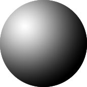
<- Intro to Visual Communication home DOWNLOAD
Assignment 5: Shades of gray [ instructions ]
[ photo ]
Tonality or value, is the relative lightness or darkness of things that we see. Our eyes have two types of receptors, rods and cones. Rods, which are much more numerous, respond to light and dark. Cones respond to colors.
Most of the information we get visually is communicated by tonality rather than color. Color communicates emotion, but tells us very little about the shape, position or substance of what we see.
Tonality transforms two dimensionsinto
three
by simulating the effect of light on surfaces as it operates in the real world. For a good discussion of how tonality adds a third dimension to two-dimensional art, see Michell Kendrick's website Typography and the History of Design.
As you might expect, there's a strong link to survival in how we use tonality. It is a key to distinguishing objects in a visually complicated environment. Judging the distance of objects is one thing: darker usually means closer, lighter means farther away. Think about looking toward the horizon - colors are lighter in the distance.
Tonality also helps us see the texture of an object, which lets us make judgements about what it's made of. If someone throws a round shiny object at you, you'll probably assume it's something hard, like metal or plastic, and duck out of the way. If the object is round but dull and fuzzy-looking, you may think it's something lighter and softer.
 You may not have thought about this before, but color has tonality as well. More specifically, color has hue (red, yellow, blue, etc.) and also tonality (lightness/darkness). We'll talk more about these—another factor, saturation—in Week 7-Color.
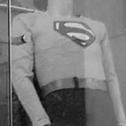
Here's a picture of someone you'll recognize where all the information is communicated by tone, not hue. We're used to seeing color, but as you can see here, tonality communicates clearly. No question who we're looking at, right?
Here's a larger version of this display, and another full-color version. You can see how color adds life and energy to the image, but is not necessary to clearly understand it.
OTHER WEEKS:
WK1
| WK2 | WK3
| WK4 | WK5 | WK6
| WK7 | WK8
| WK9 | WK10
| WK11 | WK12
| WK13 | WK14
| WK15 | WK16
Visit Al's website, Interactive Design Forum | Send Al email