
<- Intro to Visual Communication home Assignment
12/13: Scavenger Hunt / Typography in Action (RTF)
| Final Project Intro (PDF)
If you've ever used the "Font" menu in Microsoft Word (or any other program) to change the shape of the letters in a word, you've been working with typography. You've been thinking about how typography affects communication, though you may not have realized it. Whether or not you've ever studied typography, you have already learned about it. You know that the typeface (font) you use has an effect on what the viewer/reader understands.
Don't believe me? Which of the samples below would you choose for the sign on your jewelry store window?
a.
b. 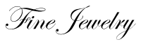
c.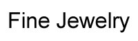
You probably said "b." Why? Because over your lifetime you've come to recognize that certain styles of letters (typefaces) are associated with certain characteristics.
So you already know more than you think about, but you probably don't know how to describe it. So we need to learn a few simple terms used to describe type.
That whatchamacallit on the end of a letter, like the short line the top and bottom of the letter "I" is called a serif. So as a starting point you need to understand that one way we talk about typefaces is to divide them into two main categories:

and
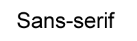
See the difference? The top one has lines at the ends of most of the letters, the bottom one, none.
There are many types of serifs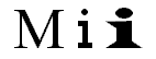 from
thick ones sometimes called slab serifs to very thin ones called hair
serifs. You'll find the illustration above and lots more interesting stuff at
the Type
Glossary on the Microsoft website.
from
thick ones sometimes called slab serifs to very thin ones called hair
serifs. You'll find the illustration above and lots more interesting stuff at
the Type
Glossary on the Microsoft website.
Historically, serif typefaces were developed first, so we still tend to see them as traditional. Sans-serif typefaces or fonts usually look more modern, even though the first sans-serif font was released in 1816. When you look at a typeface, you can usually put it into one of these two categories. If not, there are more...
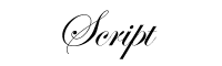
Any typeface that resembles writing done with a pen or by hand is usually called script. Script fonts can be plain:
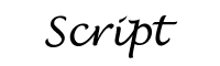
or fancy:
And then there are literally thousands of typefaces that don't exactly fit into any of the categories we mentioned. These are often lumped together in a category called "Novelty" or "Display." In typographic terms display refers to large type used as headlines, while the smaller type that includes most of the content that we read in a book, magazine or web page is called text.
From pictogram to alphabet: the evolution of type.
A gentle introduction to typography from Webmonkey
Gestalt and Typography looks at proximity and similarity, then applies these ideas to typography. (Shockwave plug-in needed)
Choosing & Using Type by Daniel Will-Harris. Good advice, and a few simple rules to follow.
Web Style Guide to Typography (applies to print, too)
FUSE magazine: fonts that push the limits of legibility.
[TOP]
OTHER WEEKS:
WK1 | WK2
| WK3 | WK4
| WK5 | WK6
| WK7 | WK8
| WK9 | WK10
| WK11 | WK12 | WK13
| WK14 | WK15
| WK16
Visit Al's website, Interactive Design Forum | Send Al email