


<- Intro to Visual Communication home DOWNLOAD:
Assignment 3: Speaking in
Shapes, Pt. 2
A few simple elements are the basis for all visual communication. If we compare learning this visual language to how we learned to speak in words, these are not even our first "words." They are more like the sounds that we put together to make all sorts of words. Visual babytalk, maybe.
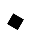
Our visual babytalk starts with the dot, the line, and the shape (in this case, a square.)
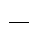
A single dot captures our attention. Where we put it makes a big difference.
If we ask people to describe the visual message above, most will describe it as stable or quiet. The fact that the dot is equally distance from all sides of the square indicates harmony or repose.
What happens when you move it away from the center?


Seeing this most people talk about stress or tension. It becomes more interesting yet not as easy to understand. Is the tension joy or fear? Happiness or sadness? There are many possible interpretations when visual spacing is irregular. The word used to describe this is ambiguity. To communicate effectively you need to learn to reduce ambiguity, a sometimes challenging task.
Here are two ads, one that is visually stable, one that is visually unstable:
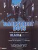

What message does each communicate about the music it's advertising? Do they make sense to you?
We learn how to interpret what we see through shared experiences. Some experiences are shared by all humans, like gravity. Thus, when we see a shape placed at the bottom of a page we would typically say it's heavy. Other shared experiences are more tied to a specific culture. When you look at art, design and visual communication from around the world you'll see both familiar and unfamiliar shapes, patterns and colors.
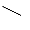
Lines have direction. They lead our eye (well, our brain, really) from left to right, since in most Western cultures this is the way we read. In other cultures where they read right to left (or top to bottom) they may"read" line direction differently.
Look at the second example above. The angled line is very dramatic, isn't it? It feels unstable, as if it's about to fall. This sort of exciting feeling generated by angled visual elements is used frequently in advertising to attract our eye.
Compare these two BMW ads:


Why do angled lines attract our attention? Maybe it has to do with survival, as do so many of our visual reactions and interpretations. If that angled line above were a tree branch, you'd be wise to stay away. It might fall on your head. Actually, the old superstition about it being bad luck to walk under a ladder has a similar basis in reality: heavy things are often dropped by workers on ladders. It's definitely bad luck to be under a falling chain saw, for example.
Similarly, our preference for things that look balanced relates
to our need to feel balanced and stable, to keep our feet on the ground.
[TOP]
If the dot, line, and shape are our first babytalk sounds, the next set of elements are our attempts to put them together into more meaningful messages. These elements are direction, scale (size), texture, hue (color), and value (lightness/darkness).
Here are simple examples of changes in...
direction

scale

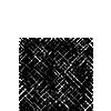
texture
hue

tone

For more on these visual elements, plus a few more, visit the
Visual
Literacy website.
[TOP]
A lot of what we do in creating visual messages is based on a few simple principles. The C.R.A.P. terms explained below are four of the most common ones. If you keep these few ideas in mind as you plan (design) your message, you'll have an easier time and more success in making something that is memorable, attractive, and effective.
Thanks to Robin Williams who didn't want to use the acronym in her book The Non-Designer's Design Book. It may be a bit crude, but I hope it helps you remember the principles.
We are attracted to significant differences: big/small, dark/light, straight/curved, smooth/rough. The key is to make differences very noticeable. A little difference in size may look like a mistake. A big difference creates dramatic contrast. Most of the time, go for the dramatic.
 Is the bottom one really
bigger?
Is the bottom one really
bigger?
 Oh yeah, now we're talkin'
[TOP]
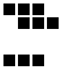 Repeating
elements creates a pattern that is often pleasing to the eye.
Repeating
elements creates a pattern that is often pleasing to the eye.
[TOP]
 When the edges of shapes don't line up, as shown here, it often looks disorganized,
haphazard. Unless you want to communicate randomness, always try to align elements
with each other. This is a hallmark of good design and effective visual communication.
Move the mouse over the image to see how alignment can improve it. Here's an
example of alignment at work in a magazine ad.
When the edges of shapes don't line up, as shown here, it often looks disorganized,
haphazard. Unless you want to communicate randomness, always try to align elements
with each other. This is a hallmark of good design and effective visual communication.
Move the mouse over the image to see how alignment can improve it. Here's an
example of alignment at work in a magazine ad.
[TOP]

 Moving elements close together creates a relationship between/among them that
is more dramatic and interesting than keeping them far apart. Of course, sometimes
the message you are communicating requires them to be apart, and that's fine.
Moving elements close together creates a relationship between/among them that
is more dramatic and interesting than keeping them far apart. Of course, sometimes
the message you are communicating requires them to be apart, and that's fine.
Books by Robin Williams: The Non-Designer's Design Book; Robin Williams Design Workshop
How C.R.A.P. is your site design? Looking at websites with the principles in mind.
Or maybe it's CARP: Basic principles of visual design. Another look at the principles in action.
[TOP]
OTHER WEEKS:
WK1 | WK2
| WK3 | WK4 | WK5 | WK6 | WK7 | WK8 | WK9 | WK10 | WK11 | WK12 | WK13 | WK14 | WK15 | WK16
Visit Al's website, Interactive Design Forum | Send Al email