<- Intro to Visual Communication home DOWNLOAD:
Assignment 4: Gestalt Samples
As we've been discussing throughout the class, as humans we appear to be "hard-wired" to respond to what we see in predictable ways. These instinctual reactions date back thousands of years and are related to basic survival needs like recognizing potential threats (predators) and opportunities (food). One of the most useful explanations for how we perceive things is based in psychological theory called Gestalt, the German word for shape.
Gestalt theory began around 1910 with three psychologists named Max Wertheimer, Kurt Koffka and Wolfgang Kohler. Artists like Paul Klee, Wassily Kandinsky and Josef Albers were influenced by Gestalt theory, as were others at the famous Bauhaus design school.
According to Gestalt theory, when we look at anything we immediately organize it into a pattern or shape rather than seeing it as a bunch of individual smaller shapes. Depending on who you talk to, there are five to ten Gestalt principles. We'll discuss the most important ones, starting with what may be the most basic: figure/ground.
A fundamental distinction we make is to separate a shape or form (the figure) from its surroundings (ground). When there is only one shape to see, we mentally organize it as figure and ground. Most of the time this is pretty easy. Typically we identify the smaller, darker shape as figure and the larger, lighter shape as ground.
Remember, being able to identify and categorize things is very important (survival). We don't like ambiguity. Identifying figure/ground is usually quick, easy and obvious. Sometimes we deliberately try to make this difficult, as with camouflage, human or animal.
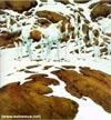
Artist M.C. Escher made a career of playing with figure/ground relationships. Some of the visual illusions we talked about in Week 2 involve figure/ground as well. Here's another figure/ground optical illusion that shows a pretty clear survival value:
Things that look similar we tend to view as connected in some way. There are various types of similarity: shape, size, and color are the most obvious. (see interactive demo for examples)
Simply put, things that are closer together we tend to interpreted as being associated. In other words, when things are close together we start to see them as a group rather than individual items. (see interactive demo for examples)
Our eye wants to follow a smooth line in a particular direction. Here is a classic example of how this principle works:

When you look at this pattern, what lines do you see? Probably those running a to b and c to d. Right?
It's equally possible that the lines go a-c and d-b, but that's not easy to get your mind to accept.
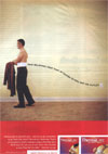
Here's continuation being used to sell you a pain-relieving product:
(see interactive demo for more examples)
We prefer to see "closed" figures rather than "open" ones. Our minds easily fill in missing information to complete the shape.
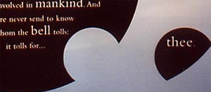
Here you see closure used to make the meaning of a famous poem immediately visible:
(see interactive demo for more examples)
We prefer the simplest interpretation of shapes, referred to as "goodness" or "Pragnantz." (see interactive demo for examples)
We respond to some images very strongly, based on our experiences in the physical world. Sharp, pointed shapes communicate danger or pain because we've felt the pain of thorns, broken glass, etc. A picture of a Thanksgiving turkey may stir memories of warm, happy family dinners. We're responding to the meaning of the image, associating it with memories we have. (see interactive demo for examples)
Interactive demo of Gestalt Principles (Shockwave plug-in needed)
Visual Perception by Daniel Chandler, has good visual examples.
The Visual Representation of Information covers many of the principles discussed above, with examples.
Gestalt and Photographic Composition: Introduction, Figure/Ground, Closure, Proximity, Isomorphic Correspondence.
Gestalt and Typography looks at proximity and similarity, then applies these ideas to typography. (Shockwave plug-in needed)
Gestalt by Betty Seabolt is a good verbal explanation with, unfortunately, no visuals.
Art, Design and Gestalt Theory by Roy R. Behrens is a detailed academic explanation.
[TOP]
OTHER WEEKS:
WK1 | WK2
| WK3 | WK4 | WK5
| WK6 | WK7
| WK8 | WK9
| WK10 | WK11
| WK12 | WK13
| WK14 | WK15
| WK16
Visit Al's website, Interactive Design Forum | Send Al email