<- Intro to Visual Communication home DOWNLOAD:
Assignment 6: Hunting hierarchy
A term that you'll hear tossed around in communication/design circles is hierarchy, which means the order of importance. The dictionary lists a few alternatives that might help you understand it better: pecking order, ladder, chain of command. In all of these, something is at the top, and others follow in clearly recognizable steps.
In the visual world this means that whenever you look at something intended to communicate, you should immediately recognize what is MOST important, SECOND most important, etc. You should instantly notice a 1-2-3 order that your eyes are drawn to.
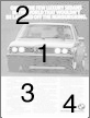
Look at this BMW ad that we discussed a few weeks ago, and pay attention to the order in which you scan it.
What are part are your eyes/brain drawn to first?
What next?
And after that?
The answers you gave indicate the hierarchy as you perceive it.
I'll bet the ad's designer planned it like this:
If this is what you saw, the ad's designer communicated his/her message effectively.
You have a variety of tools at your disposal to create a visual sense of hierarchy.
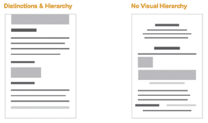
Here's an example of clear hierarchy vs. no apparent hierarchy, taken from an excellent article by Luke Wroblewski, Visible Narratives, Understanding Visual Organization:
Try your hand at creating good visual hierarchy by playing with this interactive game that starts very simply, then step by step adds more elements for you to work with in creating a sale for a bake sale at the college.
At first all you can do move is similarly sized elements around
on the page: 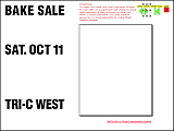
then you get different sizes to use: 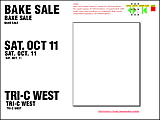
then color: 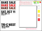 and eventually images, too.
But remember that often, "less is more." Too much variety may lead to confusion, not a clear hierarchy. OK, ready? Play the game.
At this point you should be able to look at an ad in a magazine (or anything visual, for that matter) and describe how it is organized by using the various ideas and principles learned in previous weeks (C.R.A.P. principles, Gestalt, tonality, etc.). The website shown above has more examples of how size, tone, and other principles are used to create hierarchy.
Notice that areas of type can be identified as tones, as the gray blocks above indicate. Simplifying it in this way makes it easier for you to understand how the design works.
Why should you care? Well, if you can figure out how someone else has created an effective piece of visual communication, you can use these same techniques to create and improve your own visual communication.
OTHER WEEKS:
WK1 | WK2
| WK3 | WK4
| WK5 | WK6 | WK7 | WK8
| WK9 | WK10
| WK11 | WK12
| WK13 | WK14
| WK15 | WK16
Visit Al's website, Interactive Design Forum | Send Al email