No vacation
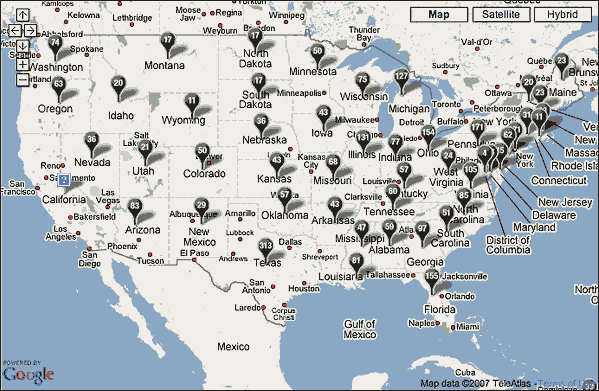
This map shows another, far more grim use of Google Maps. Unlike the maps I talked about the other day, this shows the American military death toll by state by state. It's from the Washington Post Faces of the Fallen website.
In one of those dubious technological advances we've come to accept, this online memorial allows you to search by age, year of death, month of death, home state, military branch, name, or any combination of these. Finding a dead loved one is so much easier now.
As I wrote the second sentence above I realized how inadequate this map is compared to the reality of the wars in Iraq and Afganistan:
It shows the American military death toll, not the total military death toll.
It shows the military death toll, not the total death toll.
It shows the death toll, not all the casualties.
It would take a much larger map capable of showing much larger numbers to really show the cost of these wars. That cost continues to add up: lives, money, our country's moral credibility... and what have we gotten for it?
TOP
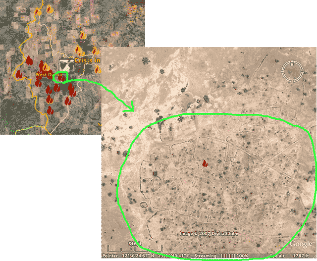
Mapping genocide in Darfur
An oddly parallel news item I just saw on Google News: The U.S. Holocaust Memorial Museum and Google Earth have combined efforts to try to draw the world's attention to the genocide taking place in Darfur, Sudan.
The small map below (left) shows the entire region with red icons where villages have been destroyed, red and yellow ones where they have been damaged. The larger map shows a zoomed-in view of a destroyed village. Only ghostly patterns of roads and pathways remain.
Google Earth gives us all the ability to see the evidence of widespread destruction for ourselves. It's right there in front of our eyes.
Start at the USHMM Crisis in Darfur website to learn more, to download and install Google Earth, and to find out what you can do.