Famous designers I've "met"
Let me be clear. I met these folks in different ways, at different stages of my life. Some I actually met in person. I shared a six-pack of beer with David Carson, lugged equipment into an East 4th Street storefront for a performance by Elliott Earls, and took Ze Frank to East Coast Custard on Pearl Road.
Others I met by sitting in the audience for a lecture or by watching a video. All have influenced me. I've listed them below in three groups based on how I think about them. Within each group they are roughly in the order I "met" them.
Gurus: They changed the way I see/think
Sheila de Bretteville
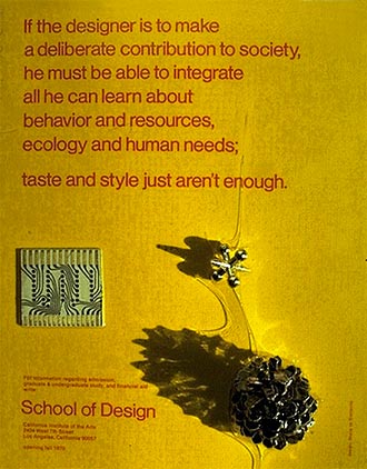 The first "famous" female designer I'd heard of. At that time likely the only female designer I'd heard of. Even more remarkable to me was her insistence that the designer had a responsibility to society.
She created this promo piece for CalArts for the International Design Conference at Aspen (IDCA) in 1971.
It had a place of honor on my studio wall for years. Still have it today.
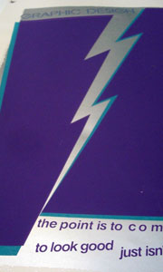
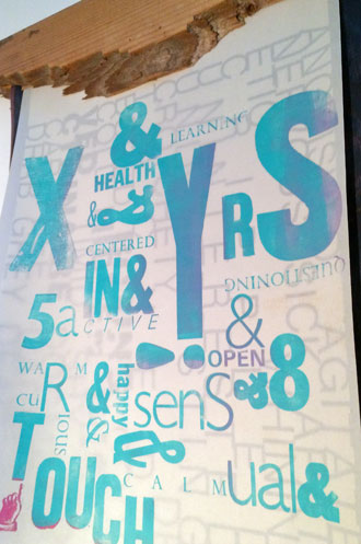
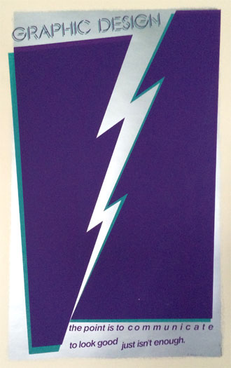 You'll notice an echo of de Bretteville in the message of this poster I designed and printed sometime in the 80s.
David Carson
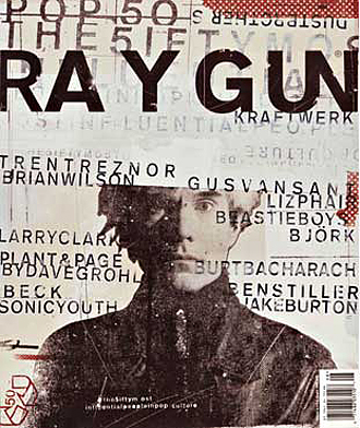 The poster boy for "grunge" typography and design. First "met" him when I saw a copy of Raygun magazine at a newsstand.
I remember being outraged by its illegible graphics. I used it as an example for my students of what not to do.
Eventually I changed my mind.
In 1995 I really met him during a workshop at Kent State. I thought he'd teach us his crazy approach to typography and layout.
Instead the first thing he asked us was what we wanted to be like in ten years. Huh?
 My answer took the form of a letterpress poster printed on multiple layers of translucent paper.
On the workshop's last day Carson and I spent several hours downstairs at Kent's Type High Press, letterpress printing what became the back cover for the first edition of his book The End of Print.
A six pack of cheap beer may have played a role, too.
[ Carson video by Hillman Curtis ]
Don Norman
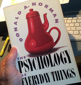 His book The Design of Everyday Things (then with the far more intriguing title The Psychology of Everyday Things), opened my eyes to how design—much of it bad—is everywhere in the world around us
Norman's idea of "affordances" (roughly, how something looks should tell you how to use it) shaped my thinking about design from that moment forward.
My Interactive Media students at Herron School of Art heard a lot about affordances. It drove them nuts (they wanted to learn software).
April Greiman
Her work impressed me because she was making art with a computer while most of us were drawing boxes and playing with typography. She also dared to use her own naked body as the central element of this life-sized poster from 1986. Designers didn't do that. Artists did. She chipped away at that boundary, something I've tried to do myself from time to time.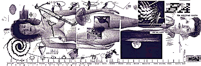
It took me 20 more years to be as bold.
[ April Greiman talks about the poster and more (video) ]
Guides: I want to be like Milton (and Ze and Elliot and...)
These people did and still do work that I admire for wildly different reasons.
Milton Glaser
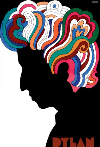 The first designer I "met" whose work looked like art. Actually shook his hand after he autographed my copy of his book when he was in Cleveland. Seemed to be a decent and caring human being.
By the way, he's the guy who created the
I ♥ NY logo.
You'll see his 60s typeface Glaser Stencil in my poster above.
[ Glaser video by Hilllman Curtis ]
[ Glaser video by New York Times ]
John Maeda
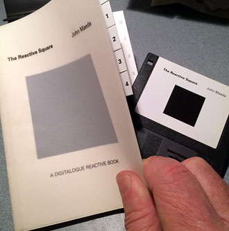 His early interactive experiments were both highly technical and beautifully artistic. He worked at the intersection of art and technology.
The Reactive Square (1995) was a printed book that accompanied a suite of 9 interactive variations on a black square, packed onto an old-style floppy disk.
(See it in action at the 6:57 point in the video below.)
He introduced it with this challenge to designers: "The 'digital' of digital graphic design refers to a mechanical process, not an original philosophy of communicative design, as it rightfully should. This philosophy will fail to materialize while designers, despite being equipped with technology befitting a rocket scientist, continue to rely on the mystical traditions of pigment on paper."
Ze Frank
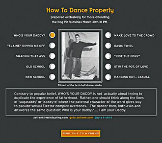 A wacky, crazy artist/designer/web personality who I met at an AIGA conference in Pittsburgh, and in 2001 brought to Tri-C to inspire students and local designers.
Great guy, ahead of his time. Way back in 2001 Ze became an overnight celebrity when the party invitation he sent to a few friends went viral on the Web. Take a look.
His website is chock-full of his experiments, many of them relying on viewer participation. They range from hilarious to painfully intense.
Elliott Earls
 Another wacky, crazy artist-designer-performer-educator whose interactive CD Throwing Apples At The Sun both mystified and impressed me, technically and artistically.
[ Video sample of Throwing Apples ]
Later I met Earls at at a Design Inquiry workshop in 2004.
With Tri-C's support we brought him to Cleveland in 2005 to perform in the first Ingenuity Festival. Never saw a designer do performance art before.
Heroes: Way cool/smart/talented...I admire them from afar
Stefan Sagmeister
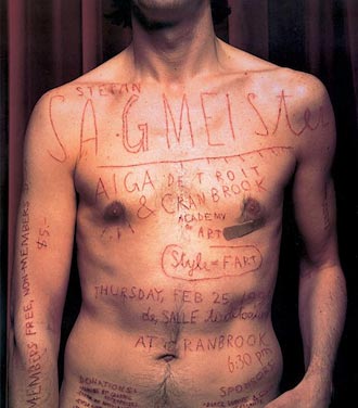 Yet another wacky, crazy artist/designer whom I've admired for years because of his willingness to make design that speaks loudly and clearly in a voice that's his alone.
He doesn't shy from putting his body into his work. He could have used Photoshop to create this poster. Instead he asked an intern carve the information into his (Sagmeister's) body with an X-Acto knife.
That's dedication.
[ Sagmeister video by Hillman Curtis ]
Paula Scher
 Saw her in Cleveland at an AIGA lecture, but really met her via a video by Hillman Curtis. She talks about how conversations about jazz led to work that was "syncopated."
How her typography for NYC's Public Theater (shown here) was like the company itself: "loud, visible, and urban."
And of course I love her insightful explanation of her logo for Traveler's Insurance, quickly sketched on a napkin. "It's done in a second...a second–and thirty-four years."
I rarely taught a class where we didn't watch that video.
[ Scher video by Hillman Curtis ]
Maira Kalman
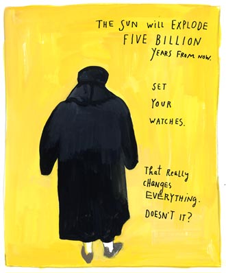 "Met" her in Chicago where a friend had the book The Principles of Uncertainty on a shelf. One afternoon I picked it up and read it cover to cover in one sitting.
Kalman draws, paints, and writes about life in a way that is charming, intensely personal, occasionally tragic.
James Victore
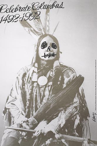
He made his reputation early on by self-publishing posters that pulled no punches.
I still check in regularly by watching his weekly Burning Questions short videos. Students, start with A Letter to a Young Designer; everyone else, pick any one that sounds interesting.
[ Victore video by Hillman Curtis ]
I also highly recommend his Skillshare course Radical Typography.
 For me, it led to work like this: