Good Website Navigation Examples:
Ben Hulse Design
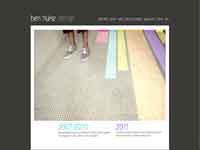
Hulse’s site is deceptively simple. The navigation bar on the Home page and the feature photograph are connected through color. Click on a link and match the “lane” color in the photograph directly below it.
I especially like where pages with photos indicate the number of pictures in that particular grouping.
Ecosimply
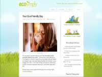
Ecosimply is not perfect. The travel from one section to another is not consistent for all navigation tabs where the green wrapper "alert" only sometimes pops up. Yes, I would like to see an scroll bar for the left-hand column of commentary, however, Ecosimply has some great, unique features I thought merit its placement in this “Good Navigation” section.
The overall design (colors, plenty of white space, lettering size, etc.) is somehow calming to me; it makes navigation around pages fairly simple. Hyperlinks are colored green to emphasize the message of the site.
Click on any large navigation tab to get a nice surprise. The information pop-up in the left column eliminates the need and time to navigate between site pages. For me, this is an exceptionally cool and welcome feature.
Other features I found useful are using images as hyperlinks in the right-hand column, and also when a blog story requires continued reading, it is marked so.
Bad Website Navigation Examples:
Maison Martin Margiela
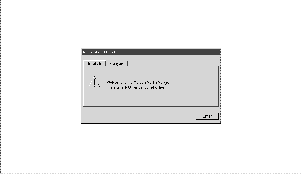
After finally getting past the “clever” (snork!) error message page (or it may be a countdown that turns into a robotic face and then counts down again...and again...), I encourage clicking the “Collections” link rather than the pictures to get a true feeling for this site. It’s amazing. This site changes daily, yet it is consistently horrible - yikes!
I don’t know what I was more stunned by: the fact that this couturier designer insists on dressing his female models as parade floats, or the pop-up questions requiring clicking but not leading anywhere. Nor do questions disappear after a selection has been made.
Navigation Issues:
The music has no controls when it unexpectedly, and loudly, begins playing. When the “Fragrance” link is clicked, the user is treated to a page that sometimes begins speaking in French (although this user selected English as her choice when entering the site). Click on any of the page’s links and get absolutely gorgeously shot videos! However, they say absolutely nothing, adding yet another layer of click frustration to this user.
HBO+EMTB
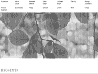
If you possess Obsessive Compulsive Disorder and your “thing” is mouse-clicking compulsively, HBO+EMTB is the site for you.
Navigation Issues:
Click anywhere on the navigation bar of this site (a great clean look by the way) and realize you may not be in Kansas, Toto, but you’ve landed smack dab in the middle of Oz.
Site Relevance:
Once a dropdown menu appears, the user can click…click…clickety-click-click-click, ad nauseam, to reveal one beautiful picture after another, but the content information below the images doesn’t change. I like the idea of being told how many pictures there are in a group like Ben Hulse's site does. Then I get the option of passing up the mystery meat if I choose.
Navigation Clarity:
Best bet? Learn Morse code. This site will help you with your clicking techniques.
Zinc Bistro
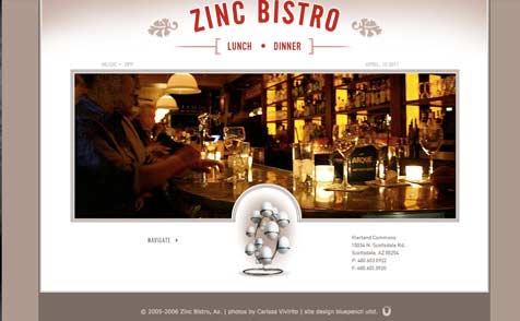
Another site with a beautiful look. One of things I like is the Music On/Off option at the top of the screen. Actually, I didn’t mind the music, nice enough jazz that I can go to the site and let it play while I do my homework.
The site is simple and there are actually very few places to navigate to, but they have significant impact on the site itself.
Website Navigation Issues at Zinc Bistro:
Strangely, the navigation bar is not located at the Lunch-Dinner
area at the top of the page where one might expect. For some strange reason the nav bar is in the form of eggs. What the significance of this is, I don’t know. Maybe because it’s a cool app that somebody just didn't want to give up?
Eggs are ordinarily a symbol of fertility. Unless eating at Zinc Bistro is advertising Eat here and you’ll become fertile,
I don’t quite understand the reasoning behind the graphic.