Navigation Lost and Found


Good Navigation
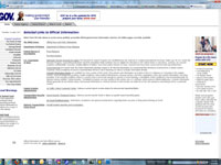

WWW.usa.gov.com
Comment:I decided to see how organized our federal government's web site was. Not sure why, but I found a site called www.usa.gov and a site called www.usa.gov.com. The one was very confusing, and the other very organized. The www.usa.gov site was hard to grasp. There didn't seem to be any simple direction that it was leading to or offering you, or a simple path if you finally did decide what you wanted. The www.usa.gov.com site, on the other hand, was very organized, easy and obvious, with a minimum of graphics.
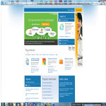
WWW.pizzahut.com
Comment:I don't generally order pizza online, but I did a few weeks ago and found the web sites pretty interesting. They seeem fairly organized and easily navigated considering the large number of choices possible, along with the deals they are promoting. The Pizza Hut site was fairly simple and easy to figure out which way to go. It was bright, yet the graphics were clear and easy to look at. One interesting observation, the choices seemed to be so obvious that I bypassed the "Start Your Order" button, not even noticing it until later.
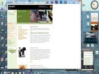
WWW.nps.gov/brca/index.htm
Comment:The Bryce Canyon website is another federal government website, for the National Park Service. It is a very clean and organized site, with at least 2 easily identified menus of navigation. A 3rd navigation is tucked in neatly, offering a translation for Spanish speakers, a site index, and Contact Us link. There are short articles and colorful graphics presented in neat rows and columns, with links to further articles.
Bad Navigation
WWW.microsoft.com
Comment:One of my least favorite sites to navigate over the years has been Microsoft.com. I find that it's the last place I actually want to go to find out anything about Windows, even if you sometimes have to go there for downloads. The site begins with pages that inundate you with possibilities, then lead you along a long and often misleading path to look for what you want. I generally give up after clicking on multiple pages that tell me I can download or upgrade something, just to continue to lead me through pages with no pot of gold at the end of the rainbow. It reminds me of the grocery store that leads me though all the canned goods to get to the milk.
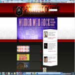
WWW.rockhall.com
Comment:Out of a sense of local pride, I went to the page for the Rock and Roll Hall of Fame to see how it looked. I expected a creative page, and hoped for some fun articles, information, and maybe a little music. I was disappointed. The site seems disorganized, with no clear path to go. It was bright, and busy, and confusing.