 We're
very familiar with subtractive color, pigment on paper. It's been around since
the earliest cave paintings. The pigment can be crayons or markers, oil paint,
or printing ink.
We're
very familiar with subtractive color, pigment on paper. It's been around since
the earliest cave paintings. The pigment can be crayons or markers, oil paint,
or printing ink.
<- Intro
to Visual Communication home DOWNLOAD:
Assignment 7: Color Schemes
There are three terms used to discuss color: Hue, Brightness (or value), and Saturation (or chroma).
Hue
When you say "what color is that?" you probably are referring to the
hue—red, green, blue, etc.
Brightness
How light or dark is it? Similarly to tonality. How much light an object
appears to emit or reflect.
Saturation
The purity of the color. Fully saturated blue is the purest hue. When you add
black or white to it, it becomes less saturated.
There are many ways that have been created to describe color, called color models. The first distinction we usually make is between subtractive color (colors of pigment) and additive color (colors of light).
We're
very familiar with subtractive color, pigment on paper. It's been around since
the earliest cave paintings. The pigment can be crayons or markers, oil paint,
or printing ink.
The color that we see is light being reflected from a surface. When light from the sun or another source is reflected off a surface—the cave wall, a piece of paper—the pigment absorbs all colors except the one that we see. So, for example, a red crayon absorbs the blue, yellow, etc. light and reflects on the red.
If you're using crayons or paint, the primaries are blue, yellow and red.
Printers use variations of these called cyan, yellow, and magenta (CYM). When these are combined you get black, in theory, at least. In reality you get a muddy brownish-gray. To get true black, printers use black ink (K), resulting in the CYMK system.
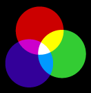 With additive
color, the three primary colors are red, green and blue (RGB).
With additive
color, the three primary colors are red, green and blue (RGB).
When these three colors of light are added together they create white.
Think about three spotlights shining on the stage, one red, one green and one blue. The resulting pool of light is white. Where else do you see RGB color used every day?
Of course! Your television, your computer monitor, the viewfinder of your video or digital camera. All use light to display color. Most televisions have cathode-ray tubes (CRT) that use bits of material that glow in RGB, while camera and flat-screen TVs and monitors use LCDs, liquid crystal displays.
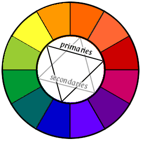 Color wheel
The color wheel, of which there are many varieties, shows primary, secondary, and tertiary colors arranged in an evenly spaced circle. By looking at color this way we can pick out certain groupings of colors that are pleasing to the eye. These are called color harmonies or color schemes.
Color wheel and other art from the very useful Sanford Lifetime of Color site.
The simplest is monochromatic, meaning that it uses variations of a single color (hue). Pick any single segment of the color wheel, say blue. Create variations of the blue by adding white to it (called a tint) or black to it (called a shade). There's your monochromatic color scheme.
Next comes analagous, which means starting with a single hue and adding those on either side of it. So starting with blue you'd add blue-green and blue-violet. This type of color scheme is very harmonious but more complex than monochromatic.
Examples of color schemes used in advertising (sample ads from the very helpful Adaholic.com)
 monochromatic
  analogous
  analogous
To bring emphasis and excitement to an analagous scheme, try adding the complement (the color directly across the color wheel from the starting point). This scheme is called split complement. So, to your blue/blue-green/blue-violet you'd add the complement of blue, which is orange.
To heighten the drama, you can go with a complementary scheme, using any two complementary colors. Simply blue and orange, in our cast. Black and white, of course, is a complementary scheme as well.
And finally there is triadic, meaning three colors equally spaced around the color wheel. Children's toys and consumer products often use the primary triad, red/yellow/blue.
 complementary
  split complementary
  triadic
Artists through the ages have used these colors schemes in their paintings. And try playing Color Theory vs. Dr. Gray and his Dechromatizer, a fun kid's game that will help you understand how color and color schemes work.
Good descriptions of the pros & cons of each type of color scheme, followed by many sample 3-color schemes.
More examples of complementary and split-complementary schemes, followed by website examples.
Color can be used to do various things, some better than others. Here are a few:
Colors may seem to mean certain things, but keep in mind that these are often specific to a particular country or culture. The color red, for example, has different meanings in China than it does in the U.S. Some meanings may be true across different cultures, but be careful about assuming that this is true.
The meaning of colors has also changed, and will continue to change, over time. Brides didn't always wear white wedding gowns. They wore green.
Some so-called standard meanings are:
Find out more about how culture, gender and other things affect how we respond to color.
Our color preferences may tell us something about who we are. Psychologist Max Luscher created a simple test that can be very revealing.
Here's a somewhat more complex version of a color preference test.
People also respond to color in very individual ways. Spend time at the Colorspeak website to explore your perceptions and those of people from around the world.
Next week we'll see how color has been used to identify revolutions around the world, and why picking the right color is vital.
It's possible that your eyes are missing certain color receptors (cones), resulting in color blindness. This condition mostly affects males (<10%), rarely females. The most common form of color blindness is a lack of red receptors, called red-green color deficit. There are two types, Deuteranope and Protanope. Here's a quick test you can take. There is also a rare blue-yellow deficit called Tritanope.
Why is this important to you, unless you have the particular condition?
Well, imagine if you create a flyer, poster, or website that uses the hue of red as a way of attracting the viewer's attention. What does a viewer with a red-green deficit see?
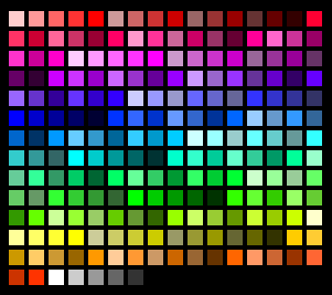 |
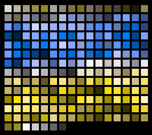 |
| Standard Windows palette | Windows palette to someone with red-green deficit |
Try this yourself: type the URL of a favorite website into the Vischeck tester to see what happens.
Create your own color schemes—and check how they look to a color-blind person—with this great interactive color chooser.
Another good one, but without the color-blindness test.
Sample color schemes—analogous, split complementary, triadic—with HTML color codes, at Color Wheel Pro.
Color schemes with great examples from the work of Monet, Van Gogh, Toulouse-Lautrec, etc.
Good explanation of various aspects of color & how it's used (scroll down
to the second half of this
article).
[TOP]
OTHER WEEKS:
WK1 | WK2
| WK3 | WK4
| WK5 | WK6 | WK7 | WK8
| WK9 | WK10
| WK11 | WK12
| WK13 | WK14
| WK15 | WK16
Visit Al's website, Interactive Design Forum | Send Al email