Fonts, Colors & Sketches
Compiling the pieces for Sheila Hart-Fowler's
Fall 2011 Final Project
Fonts
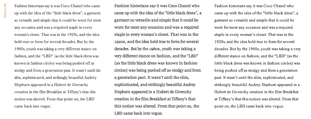
The font choices for the header, Bodoni, Didot, and Futura Light, are often used in the fashion industry. Unfortunately these fonts are not typically installed on the average computer. Therefore the header will be .png art. Meanwhile, the body and heads will be made of fonts that are similar, emulating fashion by being stylish and contrasty. The following fonts give that effect while being standard on most computers.
For text, the site will use:
Baskerville; Georgia; Times New Roman; or Times.
For heads, the site will use:
Futura; Lucida Sans Unicode; or Trebuchet MS.
For navigation and spot usage, the site will use Impact, which appears to be available on most all computers. Sans-serif will also be selected as a back-up, but Impact is the preferred font for this usage.
Colors
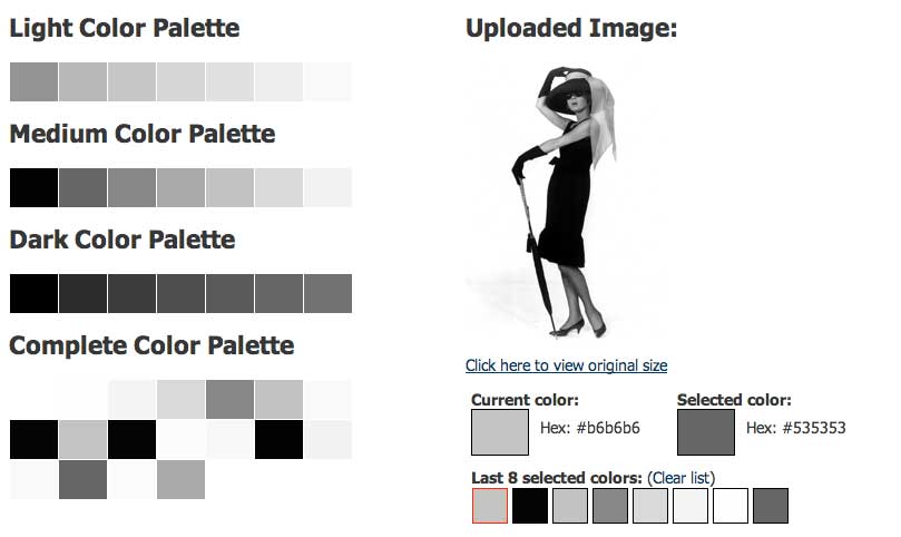
It seems rather obvious, given the name of this site, "That Little Black Dress," that the color palette should be monochromatic one playing off of neutral grays and black. To create punch, warm colors such as red, orange, brown and yellow will be used in minor elements such as rules, captions, and subheads. The palette below captures the neutrals of grays and blacks. The secondary colors will emerge out of the photos that appear on the individual pages throughout the site.
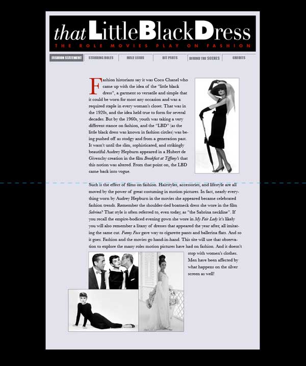
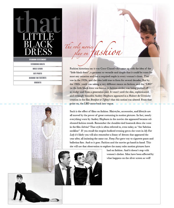
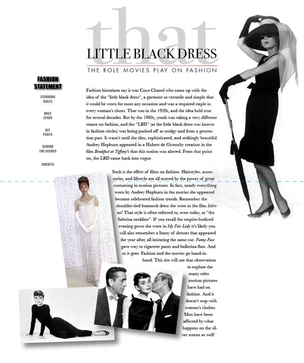
Sketches
The following sketches were done to help visualize the look for the home page of this site. Each sketch utilizes a different style header and navigation. The dashed blue line denotes the "above the fold" line to clarify what the site will look like before users scroll down. At this point, the last design shown is the preferred layout.