| |
|
| ISSUE 39 | July 2003 | updated 7/30/03 [ List of ALL BOOK REVIEWS ] |
|
First I hated it, now I love it: why I changed my mind. Things to like about the book. Things to dislike. Buying advice. |
||||
|
I bought this book nearly a year ago and tried "reading" it. I hated it: annoying, distracting, a book trying to be a website. I have a particular dislike for designers who feel compelled to try to make print into something it's not by adopting the visual cues of websites: little graphic icons, tabs, etc. At first glance that's how I pegged Experience Design.Hell, I even hated the title, a term created and relentlessly promoted by AIGA (American Institute of Graphic Arts) as a better description for what most of us call "interface design," "interaction design," "interactive design," etc. While I have an immense amount of respect for the people involved in this effort, including author Shedroff, I still find the term Experience Design to be more confusing than useful. Read about it and decide for yourself at the AIGA Experience Design site. But back to why I couldn't get past a few pages of the book. It's laid out horizontally, similar to a computer screen. It's profusely illustrated with photos, graphics, and web screenshots. The typography is often dense and hard to read. It seems to scream "I'm really, really cool!" Take a look at some sample two-page spreads from book's website. See what I mean? CHANGE
OF LOCATION, CHANGE OF HEART
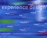
The book's organization lends itself to this approach. Each two-page spread deals with one topic: wisdom, data, meaning, feedback, technology, about 50 in all. Each topic is grouped with examples, often websites, sometimes places, things or activities. The detail of the cover at right shows how this works: the white type is the idea, the examples are indicated by gray. The cover, a 3-panel foldout, is the book's table of contents. Page 2 immediately launches into a description of (what else?) Experience Design. It gives a rationale for the term and the book itself:
The book's last chapter discusses "Symbolism" and is grouped with the theatrical production of The Lion King. Having seen and enjoyed the play I understand why it's included in the book, yet I'm still scratching my head as to why it's the last chapter. Since books typically wrap up, summarize, and/or draw a conclusion at the end, does this seems mean that The Lion King is the ultimate experience? Has Disney, the master of experience creation, done it again? THINGS TO LIKE ABOUT THE BOOK
CONCLUSION PS: I bought mine used
via Amazon
and got a virtually perfect copy for much less than the cover
price. |
|||
TOP | HOME | ABOUT | EMAIL US |
|||
 What
made the difference for me in being able to appreciate the visually rich
but potentially confusing volume is reading it
What
made the difference for me in being able to appreciate the visually rich
but potentially confusing volume is reading it