| |
|
| ISSUE 20 | News & opinion | March 2001 | updated 2/19/02 |
| NEW DIGS | BAD THINGS (GOOD DESIGN?) | |||
| Dreamweaver
raises the bar |
|||
|
Web authoring software took a big step forward with the release of Macromedia Dreamweaver 4. I'll just share a few highlights with you here (I've only used it for a few days). Look for a more thorough review in a future issue. First of all, despite significant improvements in its WYSIWYG layout capabilities, DW4 acknowledges that WYS isn't always WYG. You still need to work with the underlying code. DW4 makes it easier than ever: click a toolbar icon and you switch to a split-screen mode, HTML in the top panel and the layout view below. Click again to go to either fullscreen HTML or layout mode. Not sure what a specific tag does, or whether a CSS style works in any browser? Help has arrived. In a brilliant move (why hasn't this been done before?) Macromedia has included online reference material from an authoritative source: O'Reilly's HTML, JavaScript, and CSS books. Highlight a word and click on the <?> icon to read a context-sensitive explanation. [see sample CSS reference] [why HTML is still important] Many other interface features have been improved from DW3, and of course there are new tricks, too, like an improved table layout mode. This is a major upgrade with significant value, not just another excuse to get you to take out your credit card. Pretty
nice
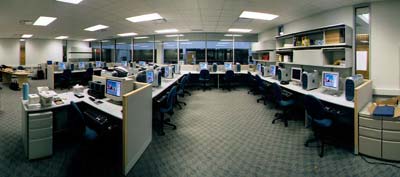
You also don't see the energy that fills these rooms as students and faculty work together in a collaborative environment. But you can find out for yourself by attending our Grand Opening on Friday, April 27, from 4-7 p.m. To receive more information about the Multimedia degree program, the Visual Communication Center of Excellence, and the opening festivities, send me your address. When
bad things happen to good design
Look at the purple area, though. That's Pageviews, representing the individual pages visitors went to. You'll see that it used to roughly parallel the total hits, but when they shot up, it actually began to decline. The new design, introduced in February, where you see the green line, didn't help. With the new, uncluttered design pageviews are declining rather than slowly rising as with the old, busy, text-heavy look. What does it all mean? Should I go back to the old look, which seemed to be much better at getting people into the material on this site? Or am I missing something here? -Al Wasco, March 15, 2001
|
Return to TOP
Return to TOP |
||
| TOP | HOME | ABOUT | EMAIL US | |||
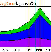 Take
a look at this graph. The green area shows total hits: gradually rising,
with a big spike for the month that we were listed in HOW magazine's
Top Ten.
Take
a look at this graph. The green area shows total hits: gradually rising,
with a big spike for the month that we were listed in HOW magazine's
Top Ten. 